These limitations can be a source of frustration. On the other hand, they can be an opportunity to play with space in a thoughtful, exciting way. As is the case of this wonderful, colorful, low-maintenance, modern zen garden. It was designed by Los Angeles-based Studio H Landscape Architecture.
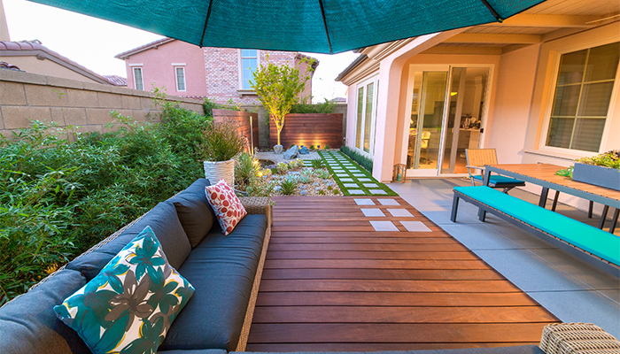
Divided into three distinct areas, each with its own purpose, it feels larger and more cohesive. There are so many lessons in this remarkable small space:
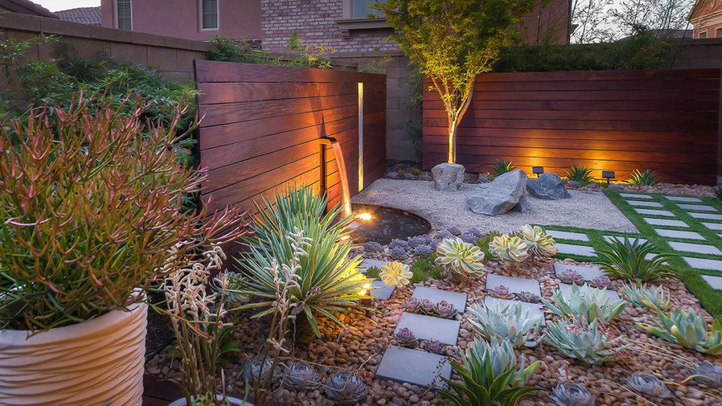
- The fountain’s gentle waterfall that helps mute the sounds of neighbor activity; lighting that highlights features and creates drama.
- Fuss-free plants (less than 20% of this garden is actually plants) with sculptural shapes.
- Breaking up the horizontal planes of the freestanding Ipe walls with an embedded opaque glass panel.
- Choosing hardscaping materials, including the genius cropping of larger rocks, add a distinctly natural touch to this built environment.
Who knew you could do so much in what would arguably be a tough space to bring to life!

The Details:
Just outside the kitchen, this long, narrow backyard was sectioned, by the clever choice of materials, into three usage areas. Furnishings, low slung, long, and narrow reinforce the lines of the space.
Free-standing horizontal panels made from the same Ipe wood as the flooring, connect the garden to the patio. It also helps to hide the not-so-fabulous existing concrete block wall. The Golden Goddess bamboo (a non-invasive, well-mannered clumping variety) will eventually cover this wall.

Genius!
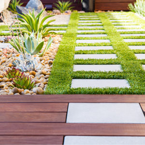
Three types of hardscaping materials–gravel, pavers, and Ipe wood flooring–add loads of texture. Plus, they contrast the narrow linear swath of synthetic turf. Turf adds soft color and also balances the impact of the green bamboo against the block wall.
The Takeaways: Waterwise Walled Garden
- When faced with a narrow long space, divide it into rooms, each with a distinct purpose. In this modest area, there are separate places for eating, relaxing, and gardening.
- Resist the temptation to push furnishings up against the wall. By giving the eye a finite place to land, it actually makes the area appear smaller.
- Never underestimate the impact of lighting! The wall washer lights at the end of the garden and under the fountain highlight features. It draws the eye to the farthest point, inviting exploration.
Design: Studio H Landscape Architecture, Los Angeles, CA
Image: Courtesy of Studio H Landscape Architecture
Related Plants
Ready to Grow?
Ship Monrovia plants directly to your door. Browse a curated selection available online.
Shop Now >


