Okay, yes, it’s a killer view. There are so many lessons here that you can apply to your own sky perch. (Even if you have a less impressive window on the world than this one's New York's Central Park panorama.)
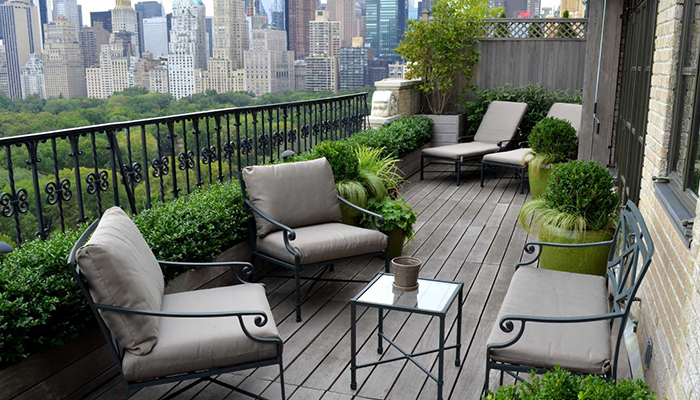
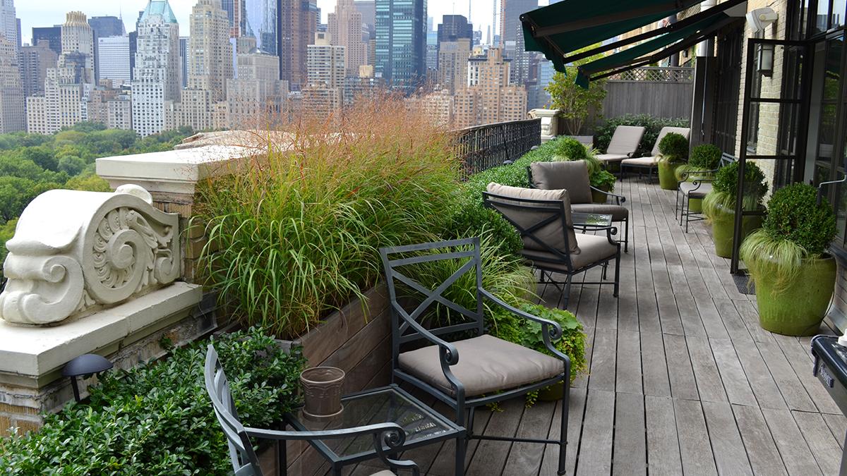
Designer Jeffrey Erb of Jeffrey Erb Landscape Design started with an existing deck and built-in planters. Then came up with a plant palette that's soft and minimalist, and felt like an extension of the gardens below. When you look at the plantings and you see the view of the park, they feel like they are one. That meant focusing on low-growing, compact plants with fine foliage. For instance, the holly hedge, breezy grasses, and boxwood orbs rather than highly manicured plants or many bright colorful flowers.
Where height was needed potted magnolia trees and borders of viburnum and oakleaf hydrangea shrubs provide structure and depth. Clusters of containers filled with perennials provide the sequence of bloom and a bit of subtle color. Try these: lady's mantle, coral bells, creeping jenny, and ajuga. Even if you have a smaller terrace or balcony, consider following this lead and design from the outside looking in.
(You have to check out the video of this garden!)

Details:
In this limited space, plants must serve up several seasons of interest, but the changes are subtle and elegant. Grasses that catch the wind, providing movement. Potted magnolia that flower in spring and leaf-out all summer. Switch grass and oakleaf hydrangea that colors-up in the fall and evergreens (boxwood and holly) that provide structure in winter.
To balance the outer wall's bank of greenery, there are glazed ceramic pots filled with boxwood orbs. These flank the doors and window on the inner wall. The underplanting of grass makes them less formal and ties them to the breezy look of the main planters.

Genius:
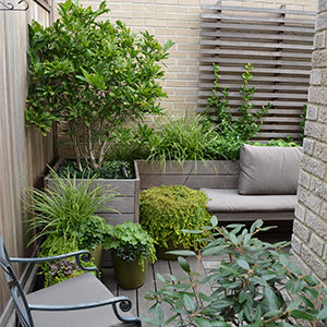
Every inch of this tight little corner is put to good use. Against soaring blank walls, a vine-clad trellis and small tree bring much needed color, scale and interest. Check out the narrow bench attached to raised beds that adds extra seating.
Takeaways:
- Make better use a long narrow space by breaking it up into different “rooms” (or “conversational clusters” in designer-speak).
- Choose plants whose colors, shapes, and textures feel like an extension rather than a world apart. This will create a seamless experience that connects your space to views.
- Vary heights for oomph, but remember to choose plants that won’t eventually block the view! No one wants to be clipping too-tall shrubs into submission.
- Repetition, such as the green pots, infuses a space with a sense of movement (and oddly calming, too).
Design: Jeffrey Erb Landscape Design
Images: Courtesy of Jeffrey Erb
Get the Look
Ready to Grow?
Ship Monrovia plants directly to your door. Browse a curated selection available online.
Shop Now >


